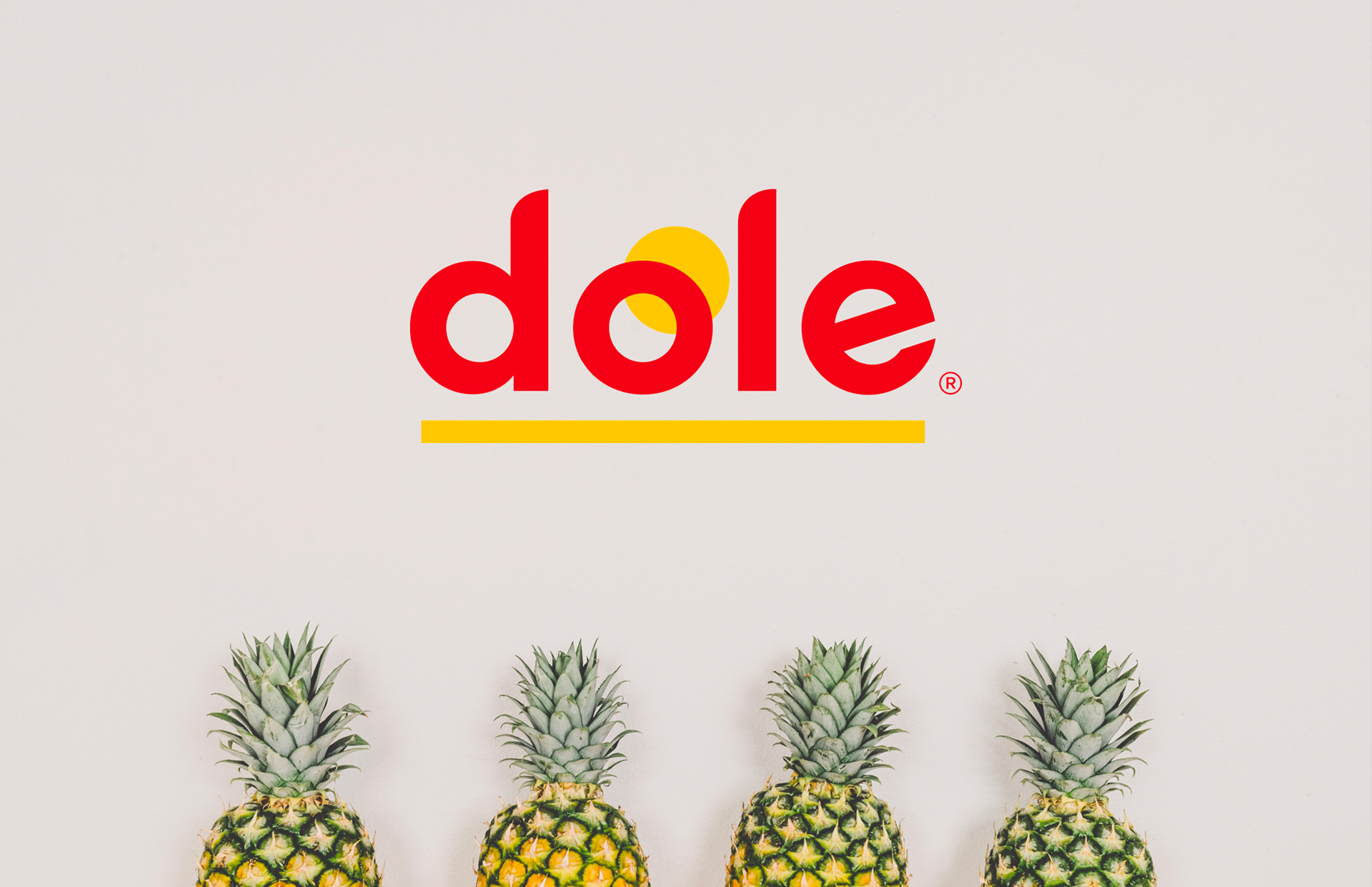
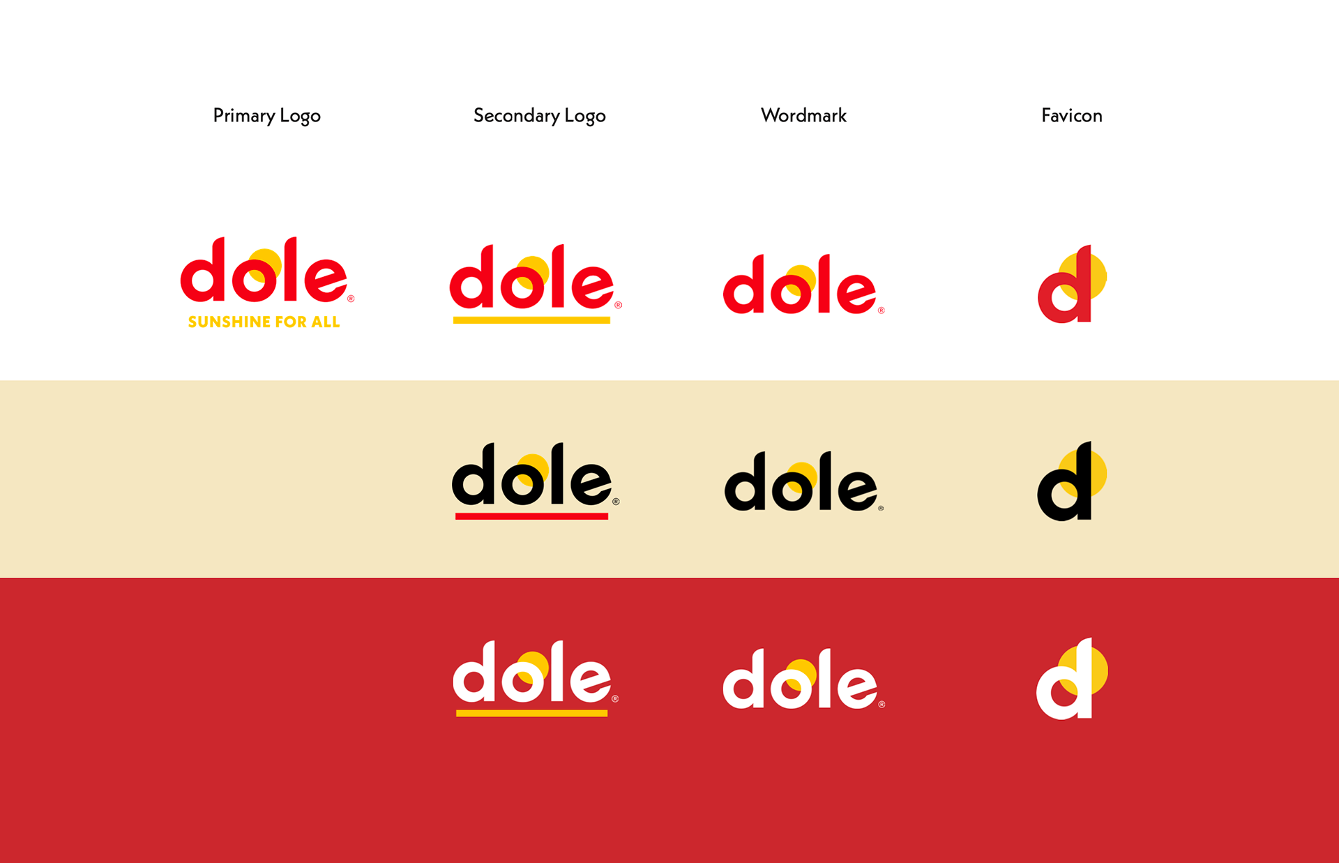
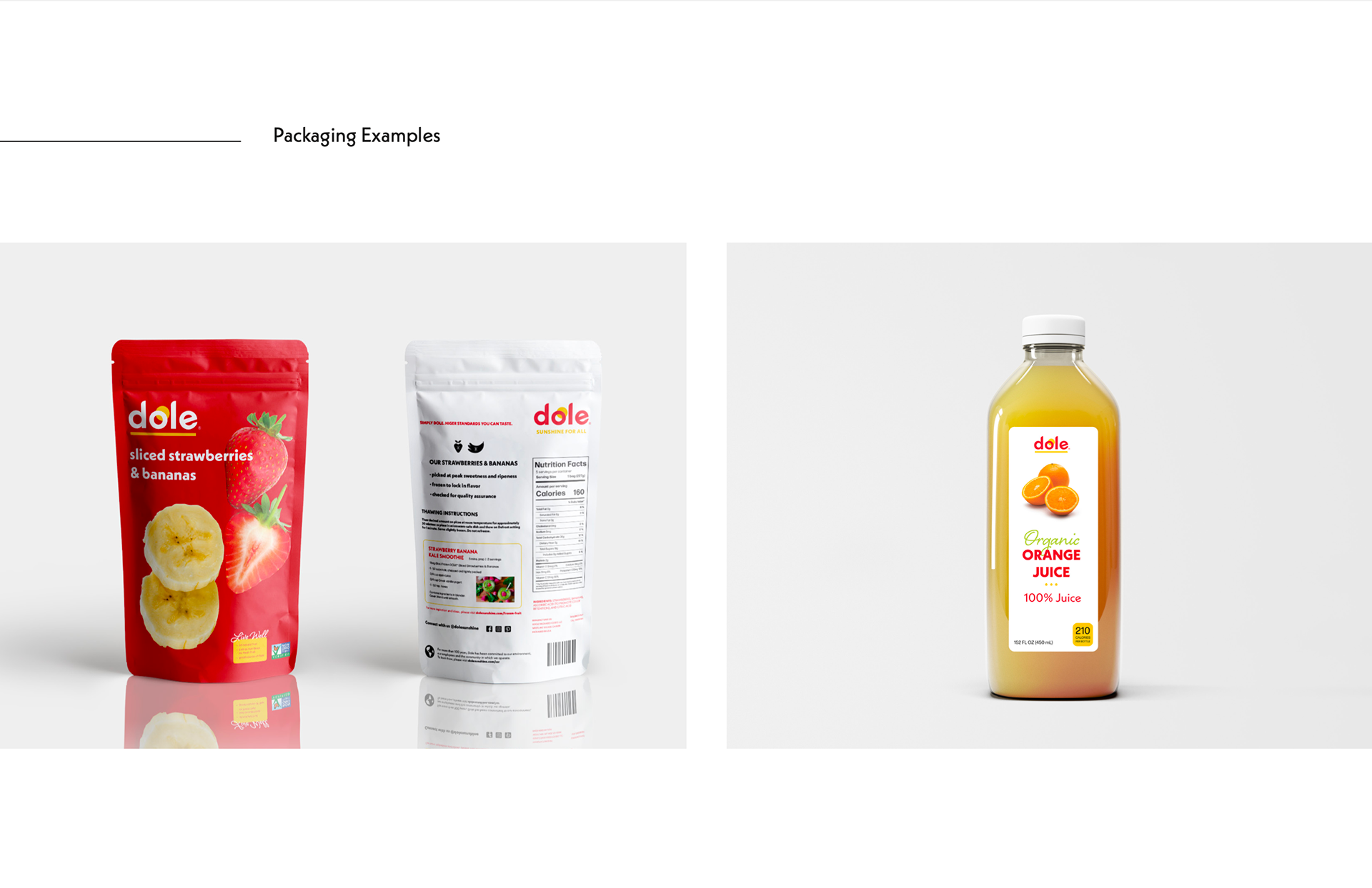
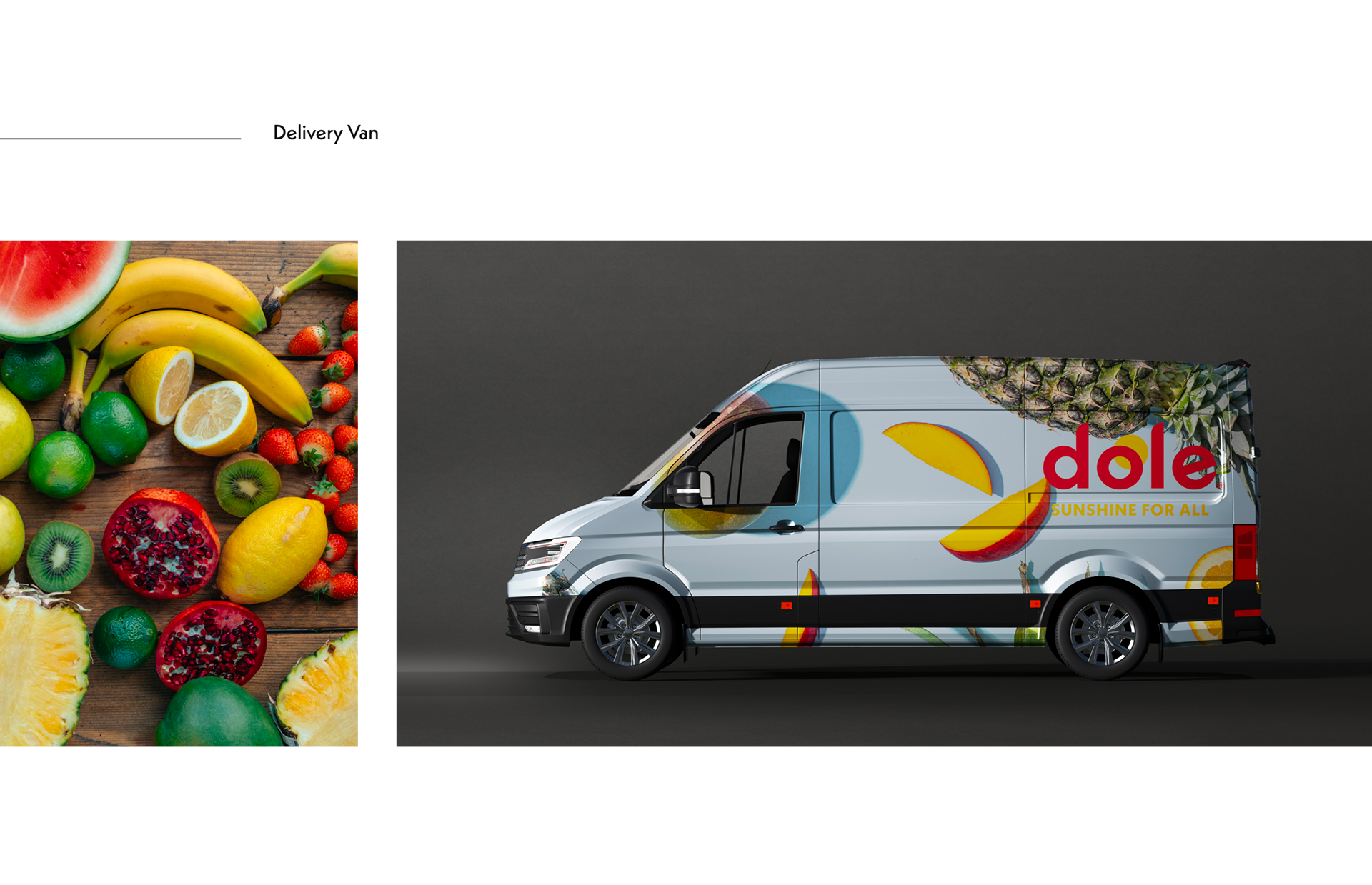
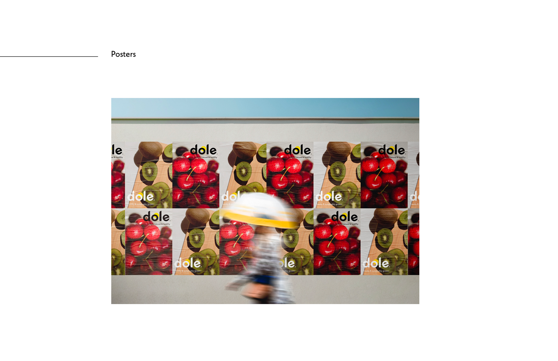
Dole, the well-known brand for fresh fruits and vegetables, is redesigned to a more modern, approachable, and reliable look through a visual rebranding.
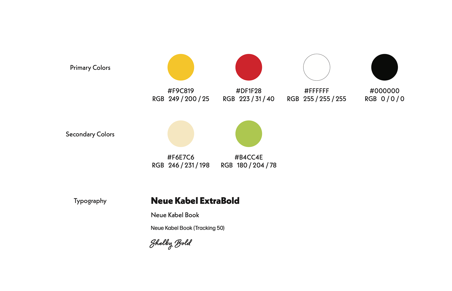
While preserving the original colors and brand values, which emphasize trustworthiness, friendliness, sustainability, and responsible farming practices, this redesign aims to captivate both new and existing customers with a contemporary twist.
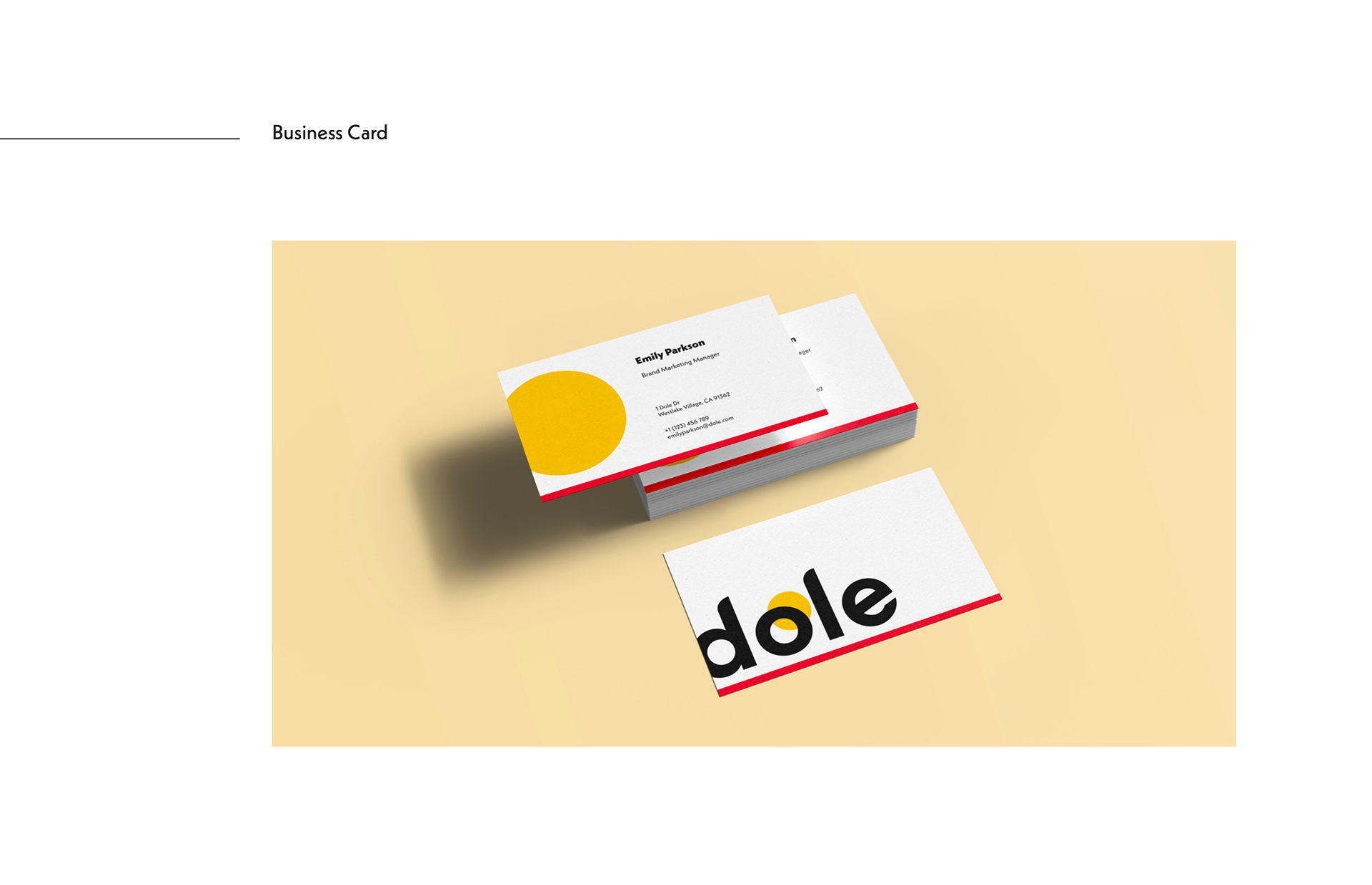
The new logo draws inspiration from the original logo’s sun imagery, symbolizing natural production and freshness. The letters are crafted using the Neue Kabel base font, featuring rounded and clean characters that align with the brand’s delightful image. This simplistic and modern design strongly communicates the brand’s commitment to sustainability and responsibility, conveying its core values to viewers.